Ideas made
visible.
Campaigns, print layouts, and visual systems that give a message its own unmistakable presence.
Explore the design work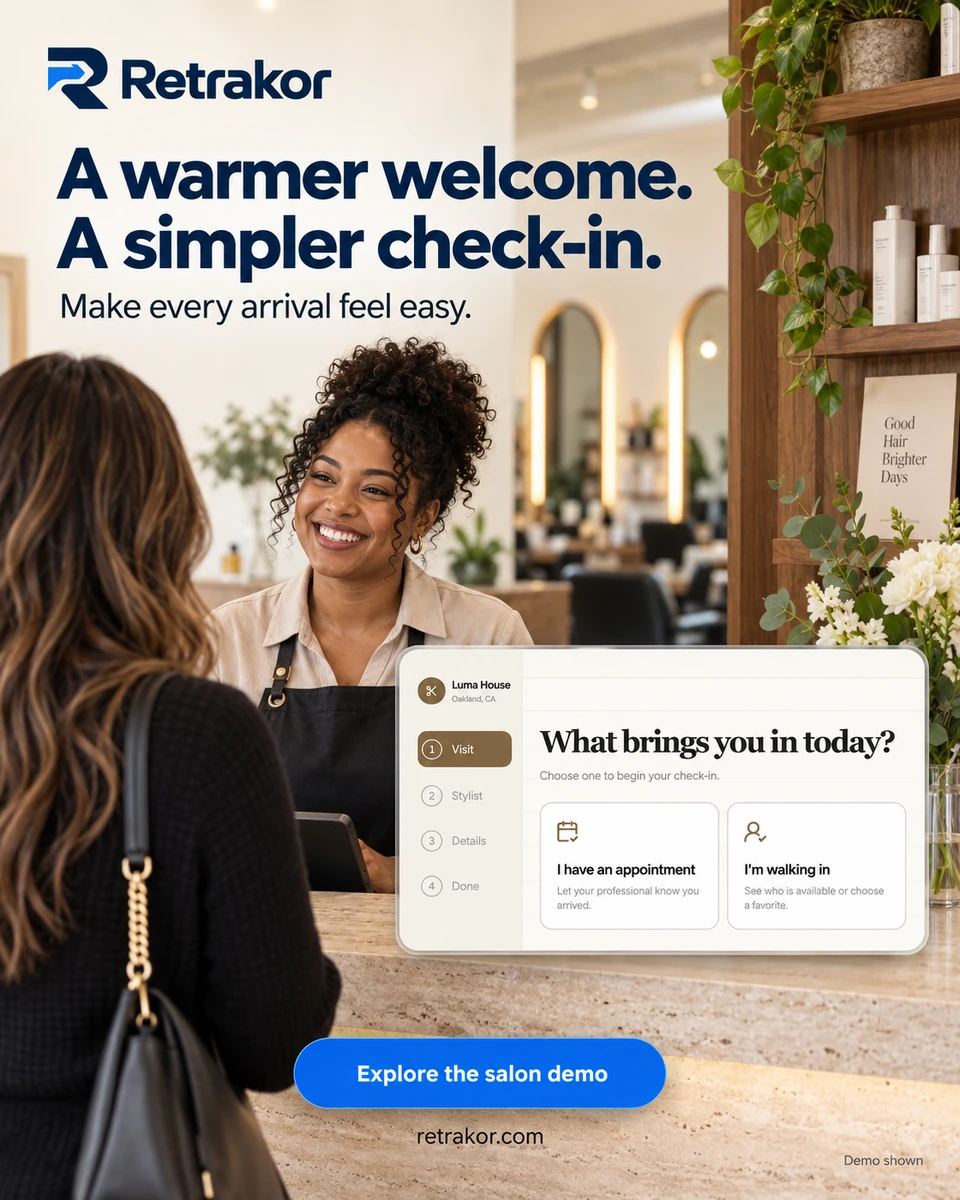
Distinct voices. A considered visual system for each.
The work, up close
Four brands.
Four different stories.
25 selected pieces spanning campaigns, identity, print, and environmental concepts. Explore the thinking behind each system and open any artwork at full size.
01 / Product storytelling / SaaS
Retrakor
Make the product
feel human.
A connected campaign system for salons and automotive businesses, carrying check-in, loyalty, and follow-up from screen to counter.
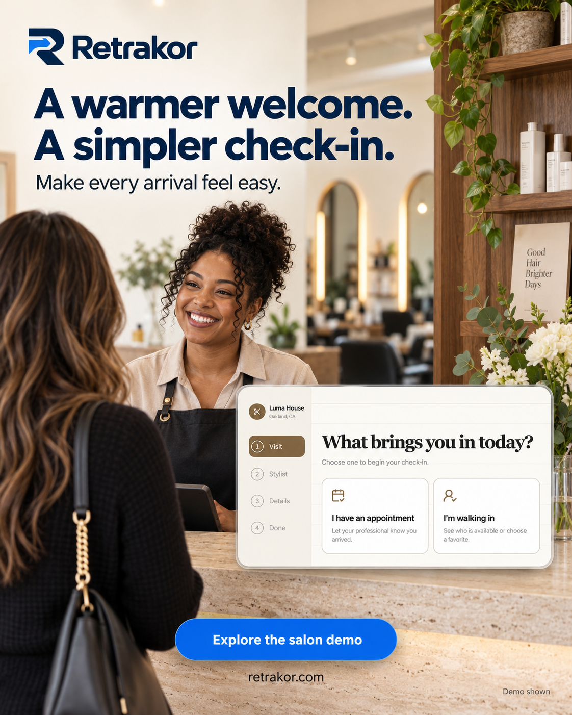
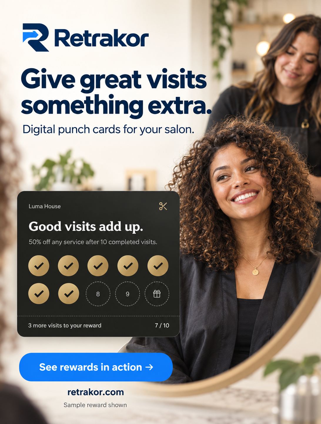
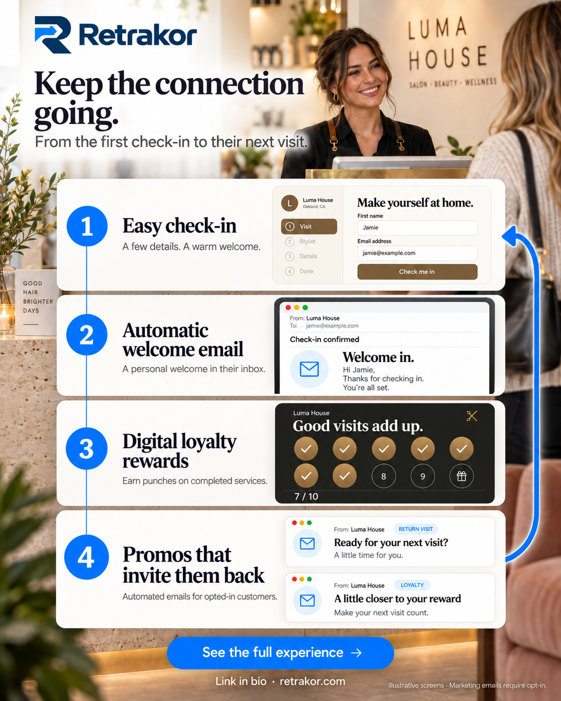
Make a connected software experience understandable at a glance, from a first welcome to a return visit.
Warm, people-led scenes meet a consistent blue headline and action system. Interface details sit inside the story, giving an abstract product a recognizable place in a customer’s day.
Six selected designs: salon campaigns, an automotive adaptation, a process graphic, and a QR counter-sign concept.
Campaign artwork with illustrative scenes and interface treatments.
Campaign system / beyond the salon
One language. Different front desks.
The blue headline, interface card, and clear next step carry into automotive service. A two-step email graphic explains the experience, while a counter-sign concept brings the same visual language into a physical setting.
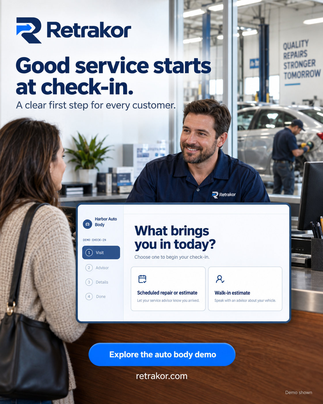
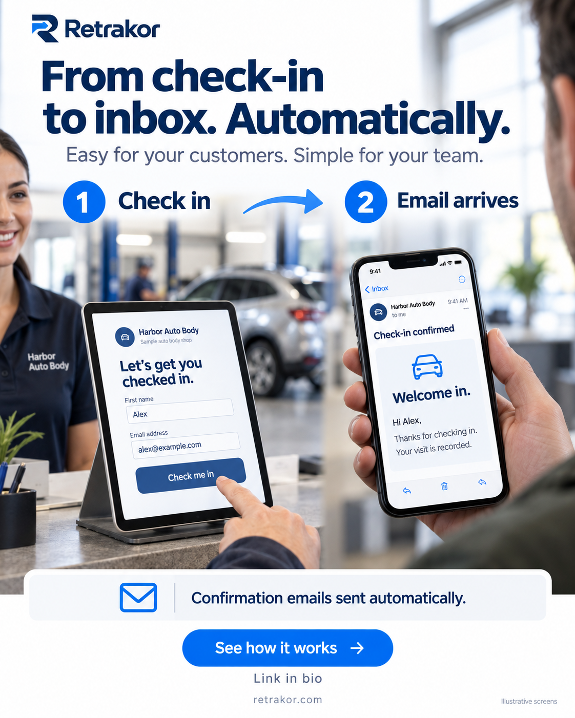
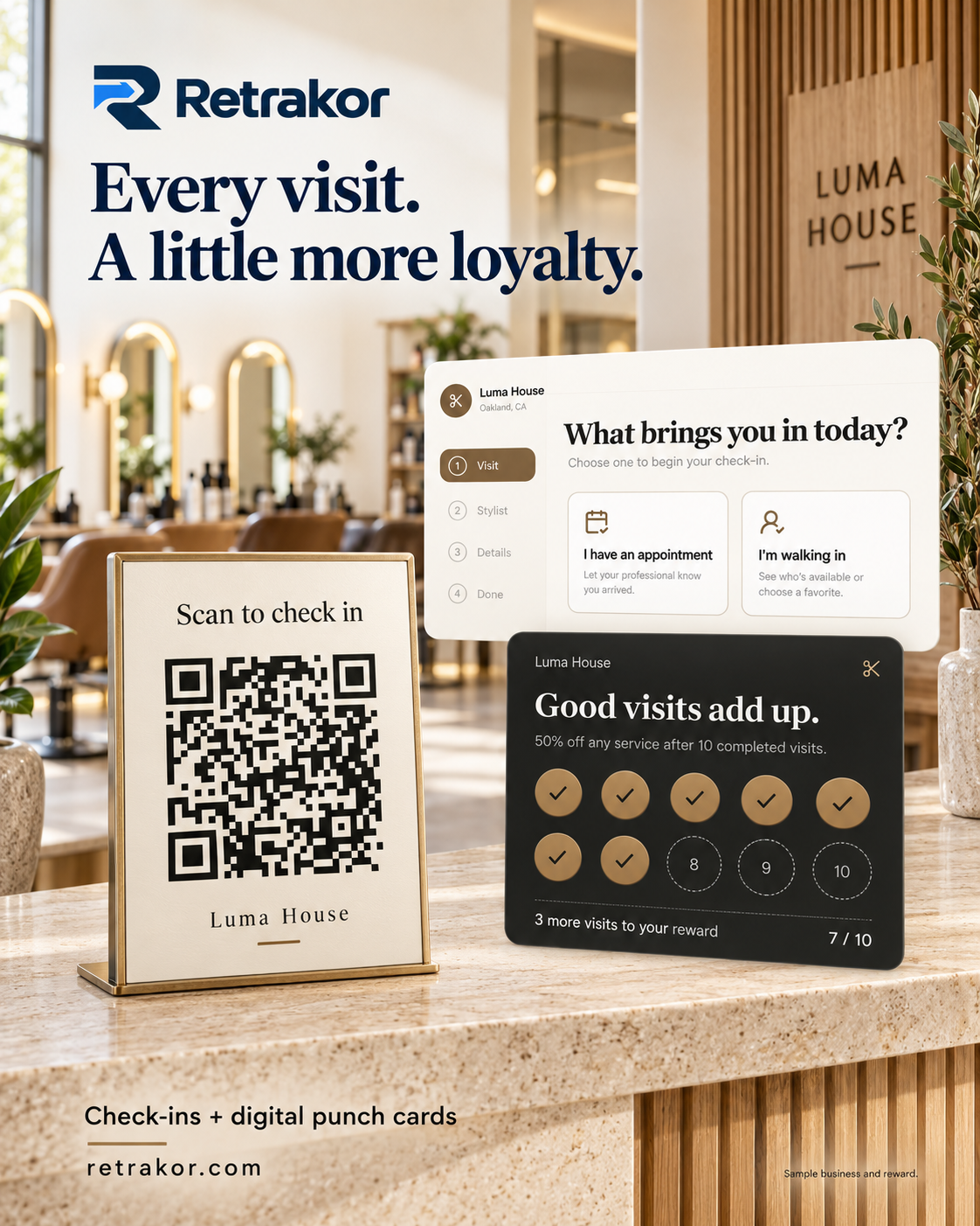
The QR counter display is a design concept shown in an illustrative setting. A printed or installed sign is not documented.
02 / Hospitality / brand atmosphere
Massage Vibez
An invitation
to slow down.
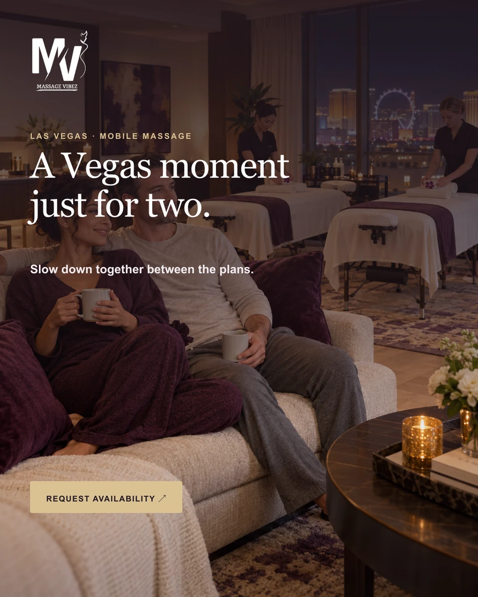
A Las Vegas campaign built around three moments: after the convention, time for two, and before the evening begins.
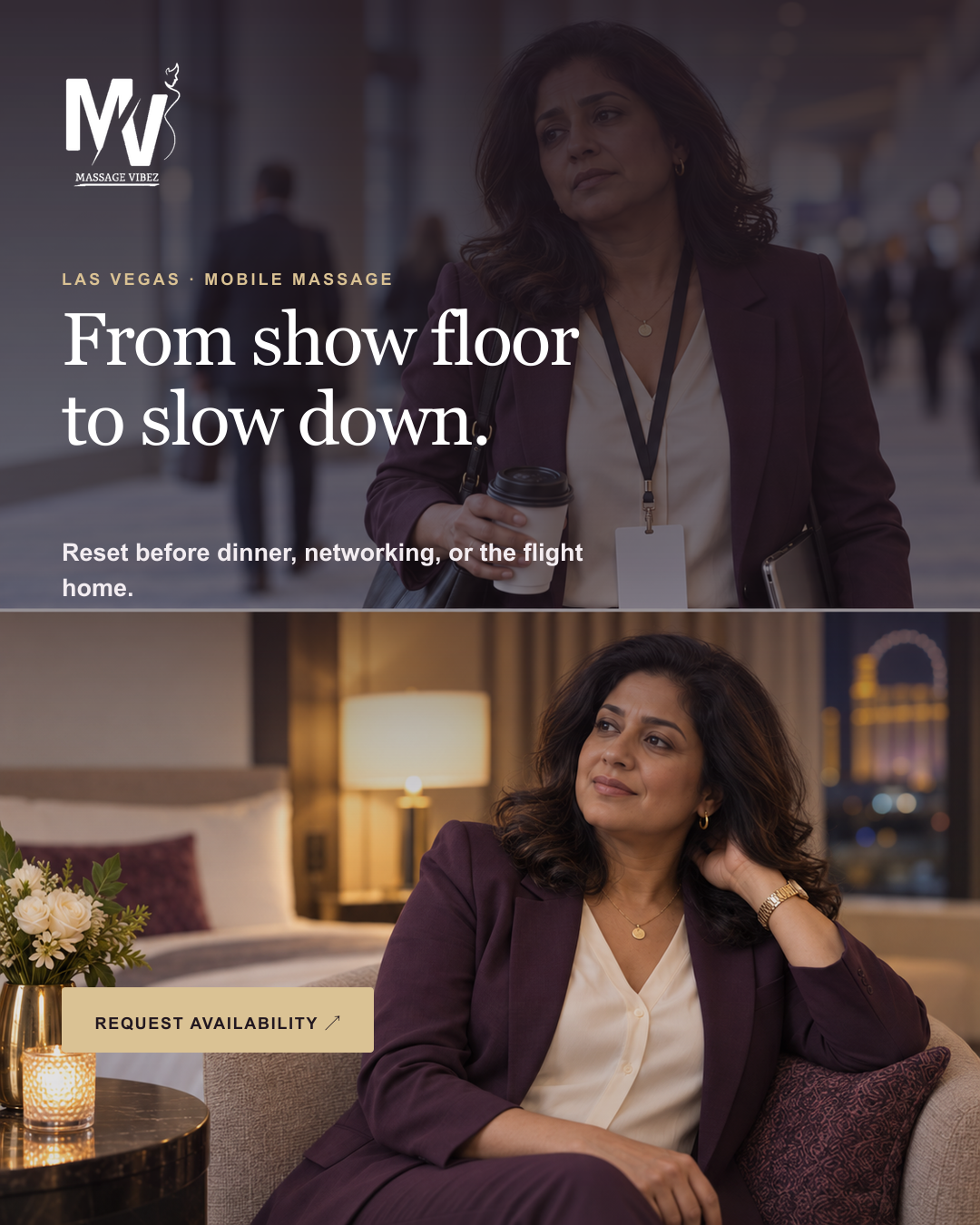
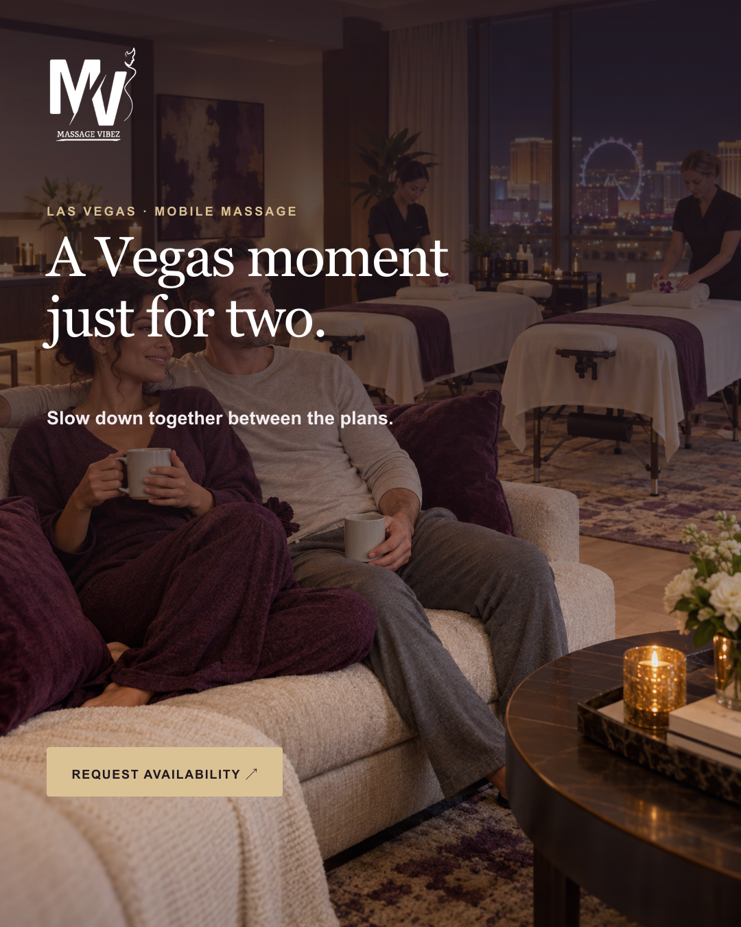
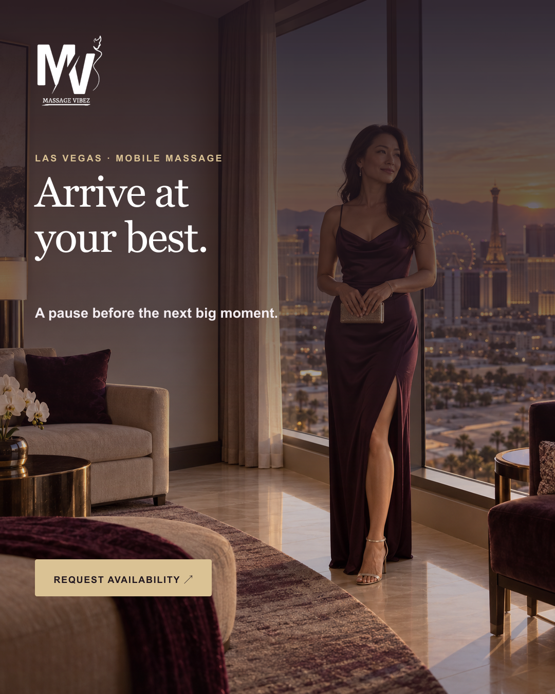
Give a mobile massage service a consistent visual presence that feels calm, personal, and connected to its audience’s plans.
Editorial serif headlines, warm gold accents, and a restrained dusk palette bring the pieces together. The image sequence carries the change of pace while the message stays short.
Six selected graphics: three occasion-led campaigns and a convention-recovery idea adapted to landscape, feed, and story formats.
Illustrative campaign scenes; no customer testimonial or on-location photography is implied.
Format study / one campaign, three placements
Recompose. Keep the feeling.
One convention-recovery idea adapts to a wide placement, a portrait feed, and a vertical story. The imagery, serif headline, and gold action stay recognizable as their position and scale change with the canvas.
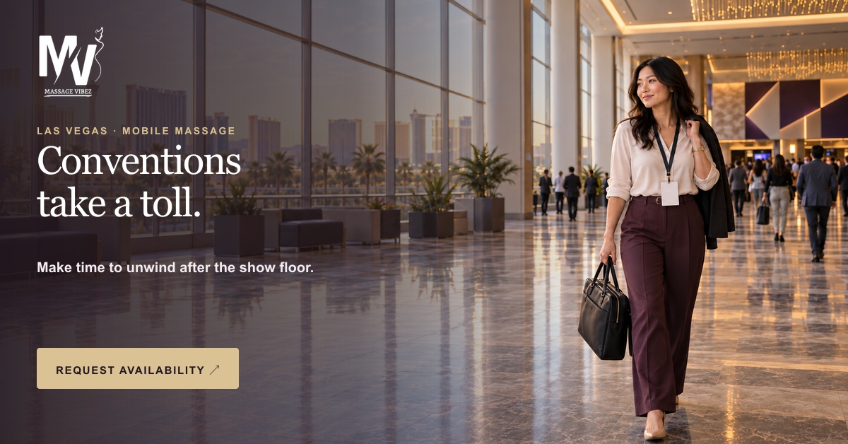
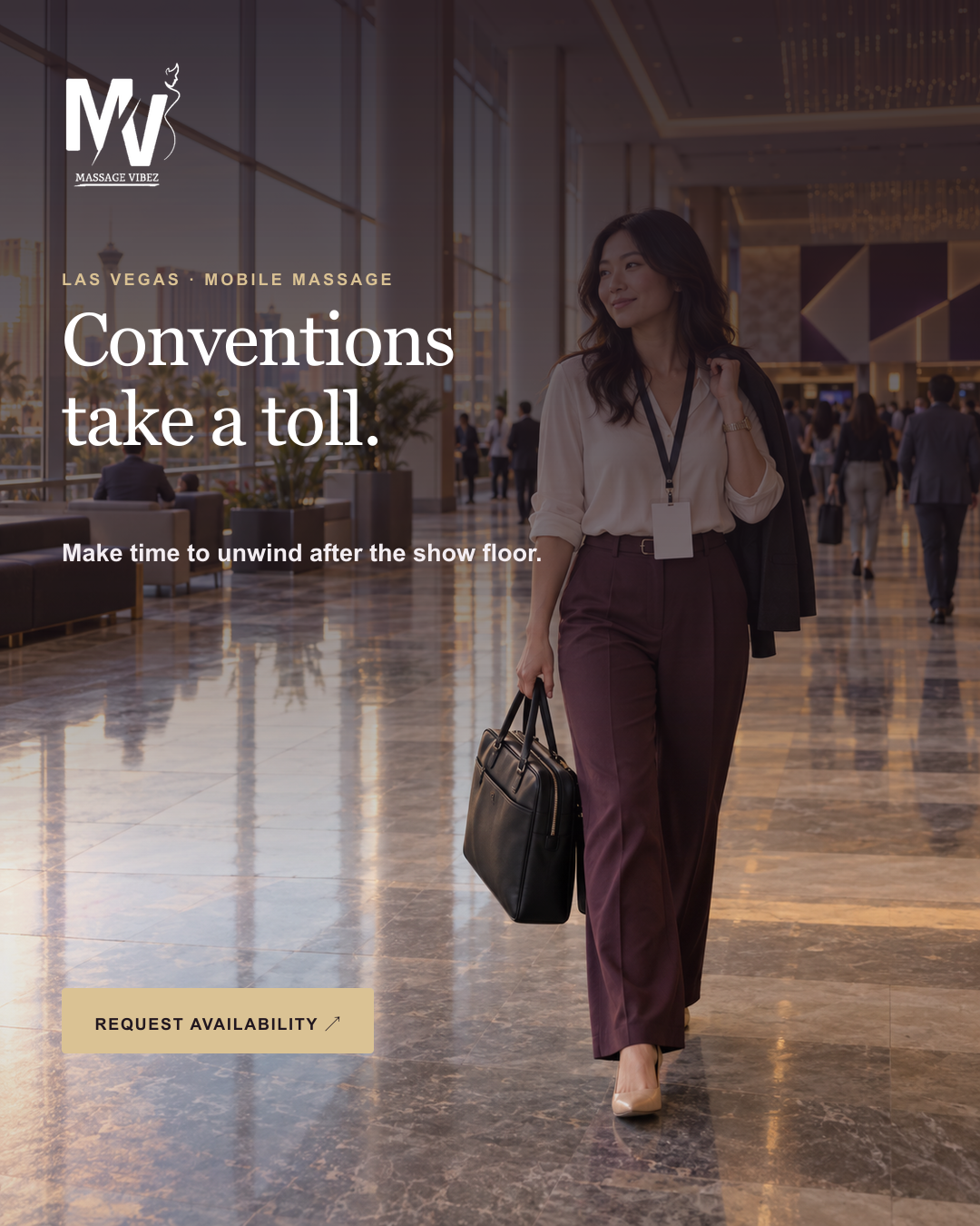
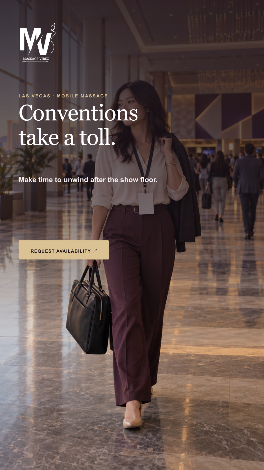
Existing campaign compositions shown at their original proportions: 1200 × 628, 1080 × 1350, and 1080 × 1920 pixels.
03 / Launch campaign / sports technology
Tailgate
Build a world
around the launch.
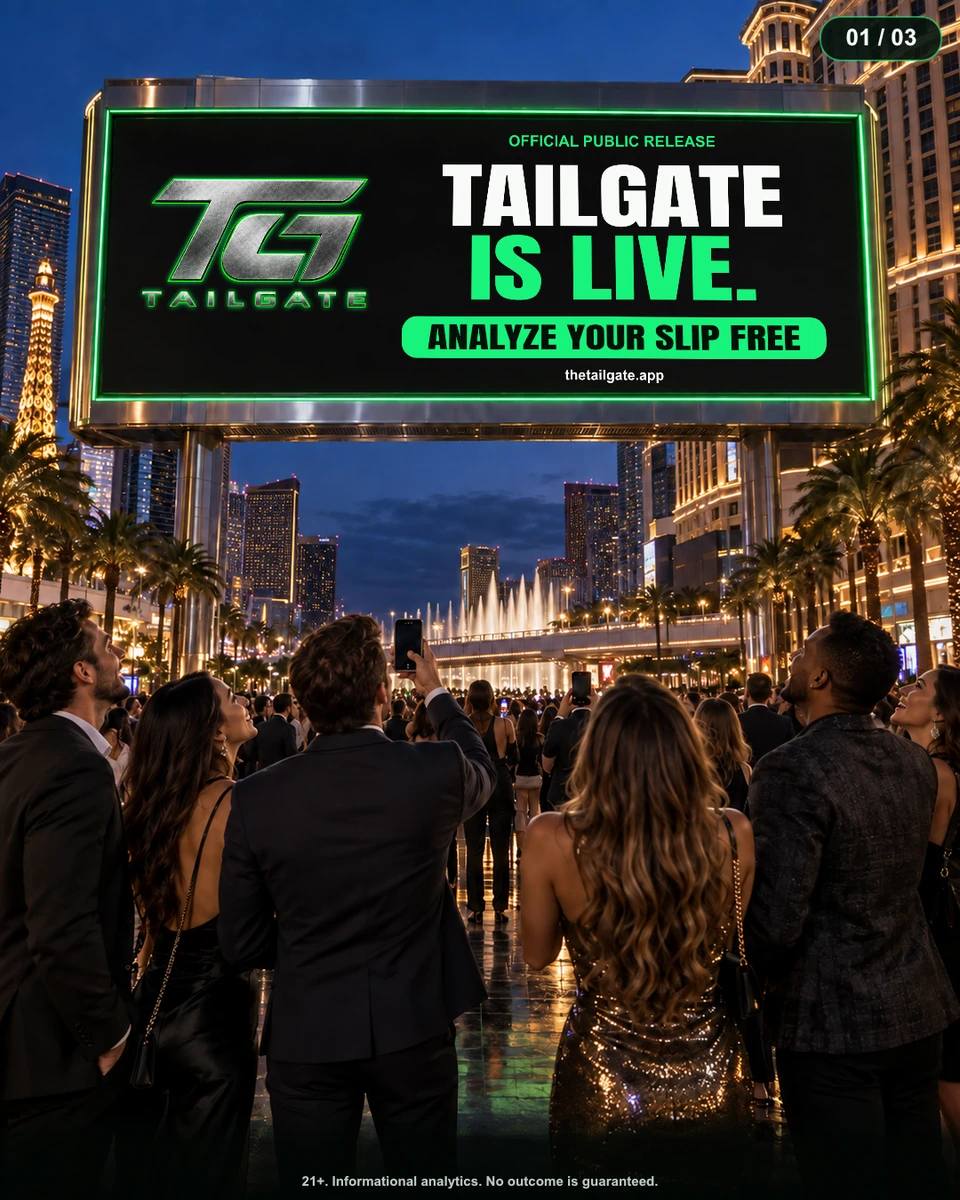
A recognizable visual language carried through a city-scale launch image, a social scene, and a product explanation.
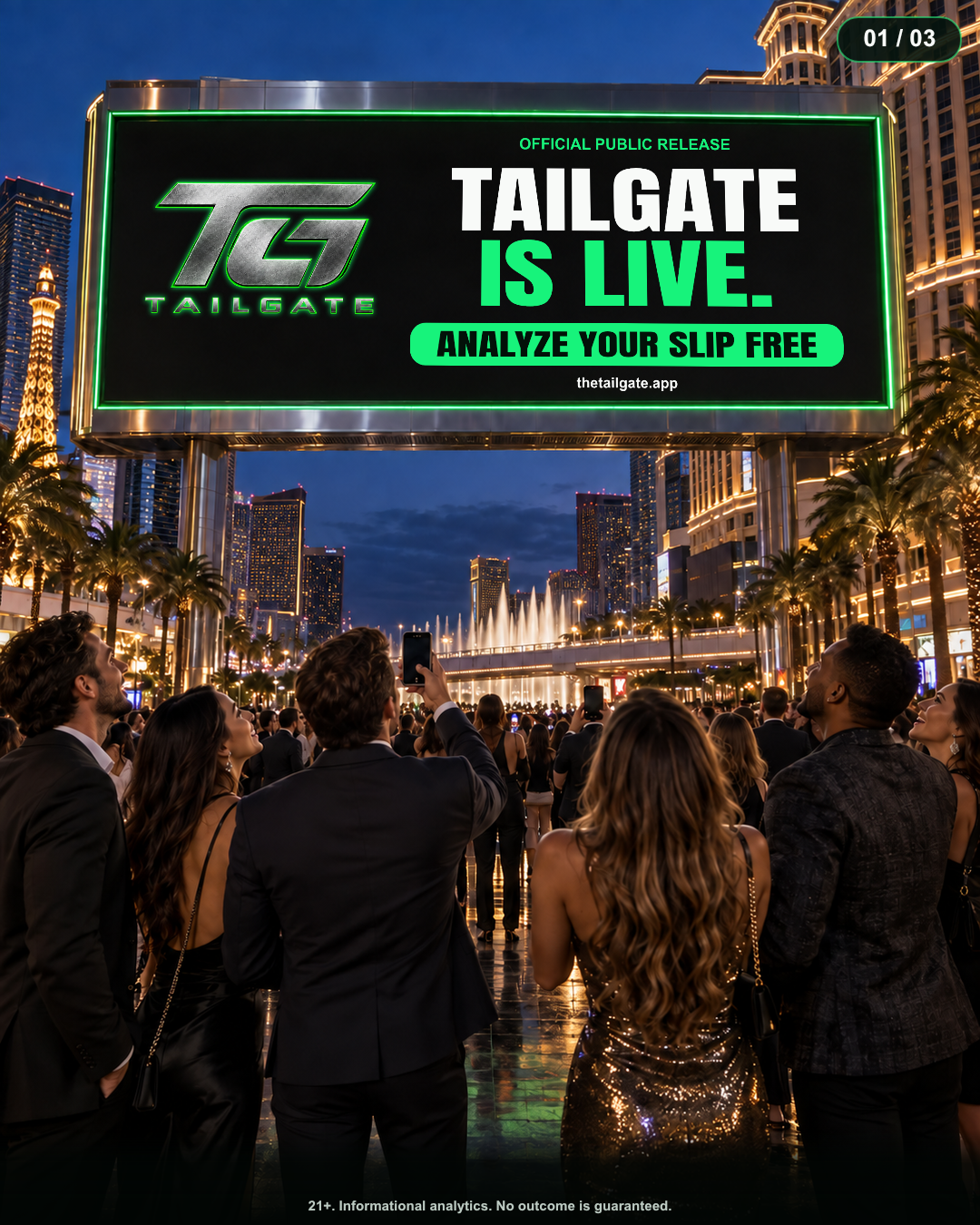
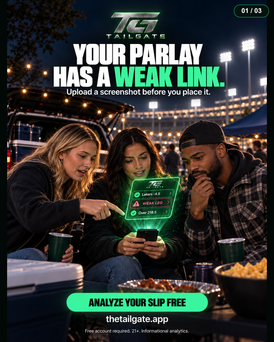
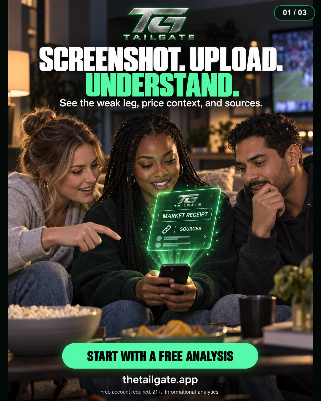
Create a consistent launch campaign for a sports-analysis product across several messages and settings.
Electric green, condensed typography, and dark environments establish a strong visual signature. A repeated screen motif connects the brand announcement to the product story.
Six selected pieces spanning portrait campaign layouts, identity artwork, a wide banner, and an environmental mockup.
The billboard is an illustrative advertising scene, not evidence of a purchased placement or physical installation.
Identity / format / environment
Recognizable at every scale.
A metallic monogram, a wide campaign banner, and an environmental mockup show how the electric-green identity carries across different shapes and viewing distances. These pieces are presented as a study of typography, contrast, and composition.
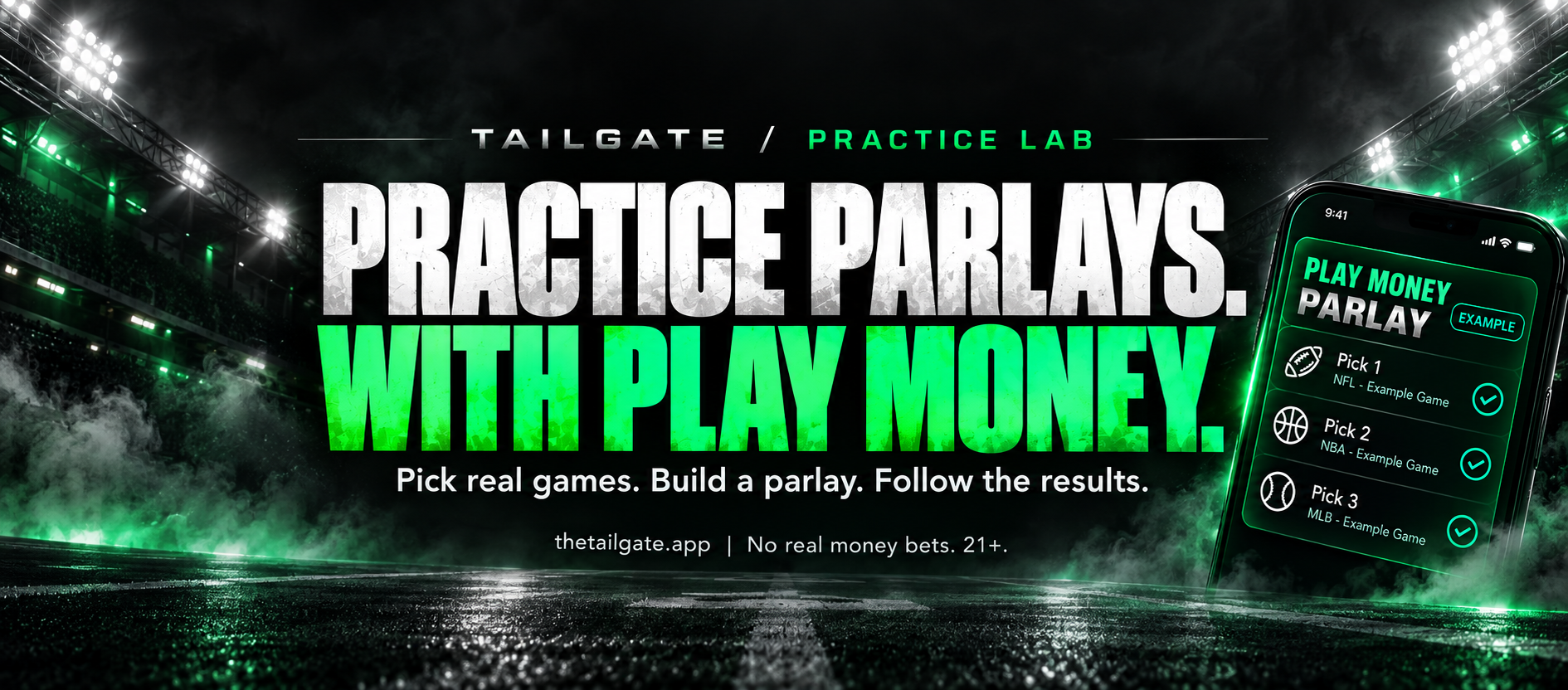
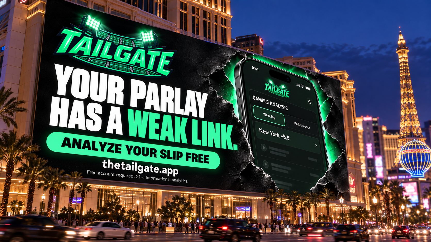
The city billboard is an illustrative placement mockup. No installation, media purchase, or campaign result is implied.
04 / Campaign / print / identity
Blueprint Media
Give complex ideas
a clear visual order.
Campaign graphics, an editorial brochure, and a partner identity: distinct messages organized through deliberate typography, imagery, and layout.
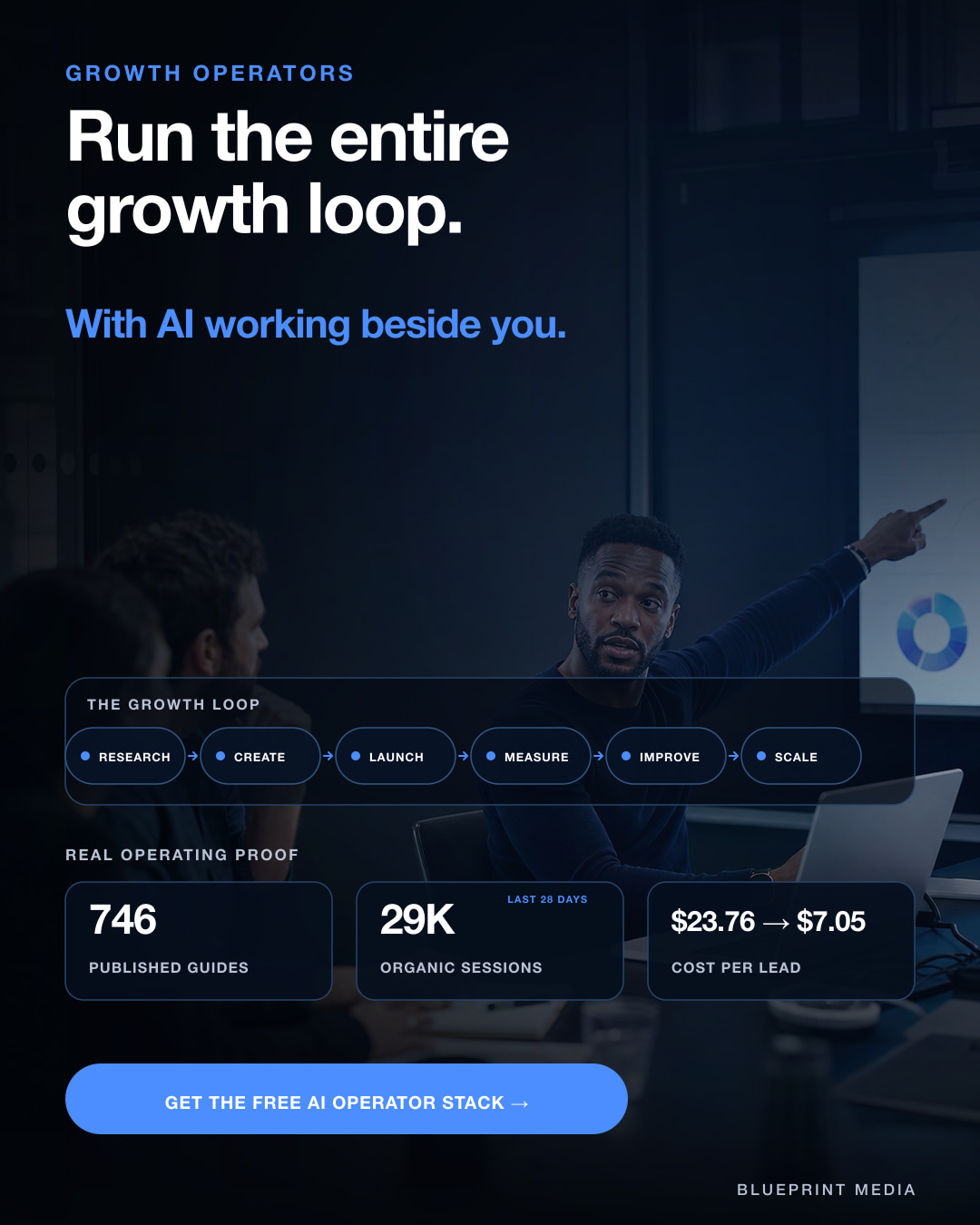
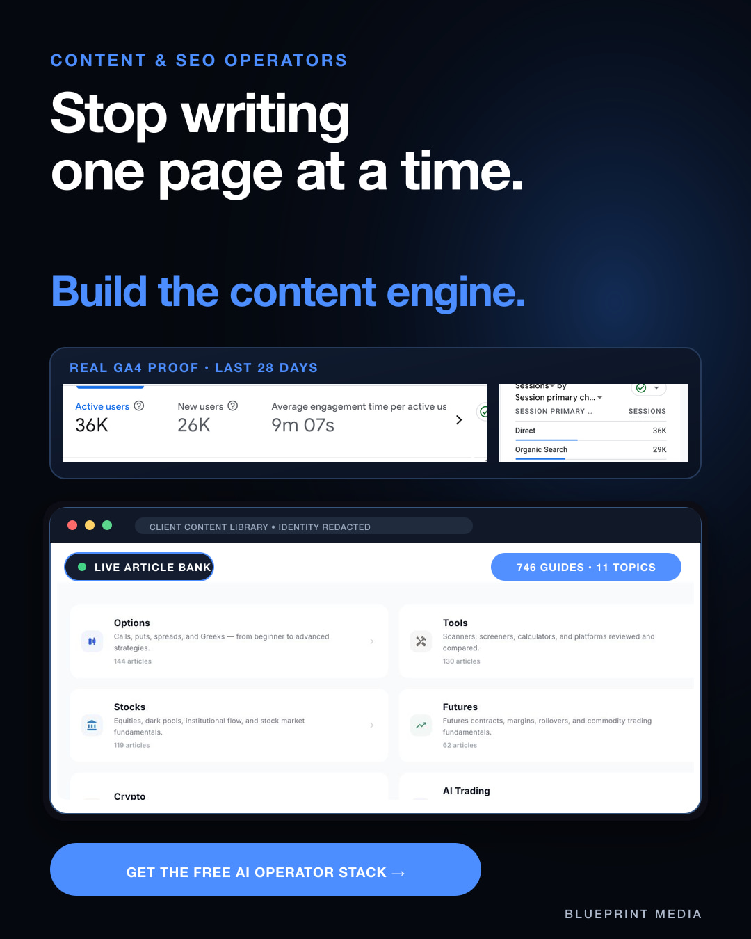
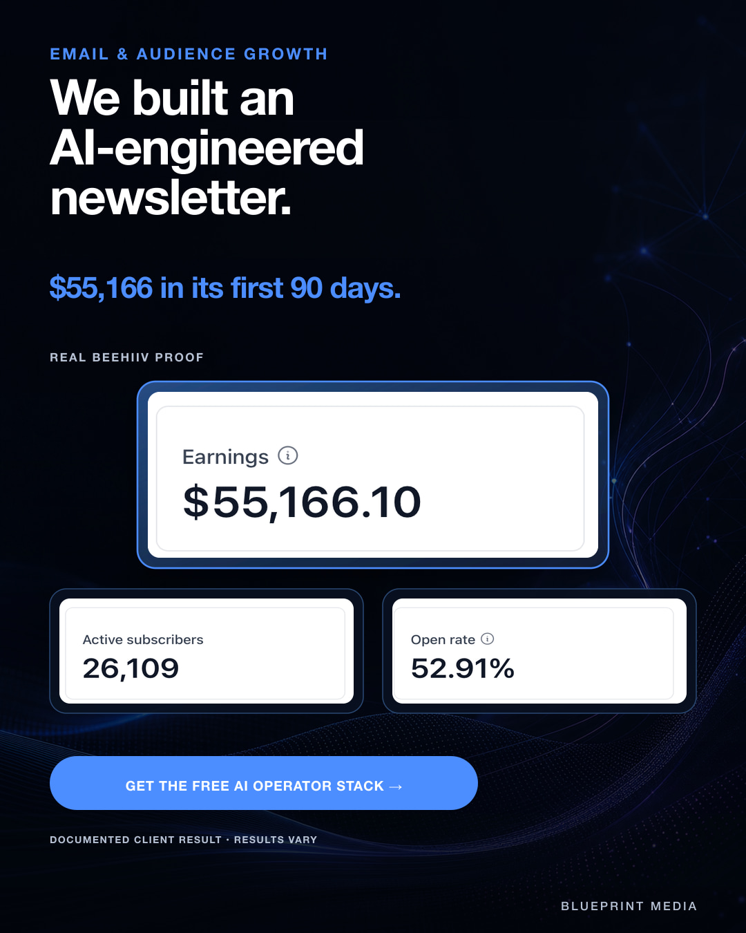
Connect several campaign topics through one brand system while giving each graphic a clear lead message.
A shared navy canvas, blue accents, strong type hierarchy, and modular information panels establish continuity. Each composition moves from headline to supporting detail to a final action.
Seven selected pieces: campaign graphics, both brochure spreads, source illustration, and a partner-card presentation, plus one motion adaptation.
Figures within the original artwork refer to the examples documented in its source files. They are not results attributed to these graphic designs. Workplace figures are illustrative.
Print design / editorial layout / partner identity
A message you can hold.
The Next Chapter brochure organizes a service story across six panels. Its connected architectural forms give the cover a visual idea, while the inside spread turns the process into three clear stages. A separate partner-card concept uses a more personal navy, cream, and gold identity.
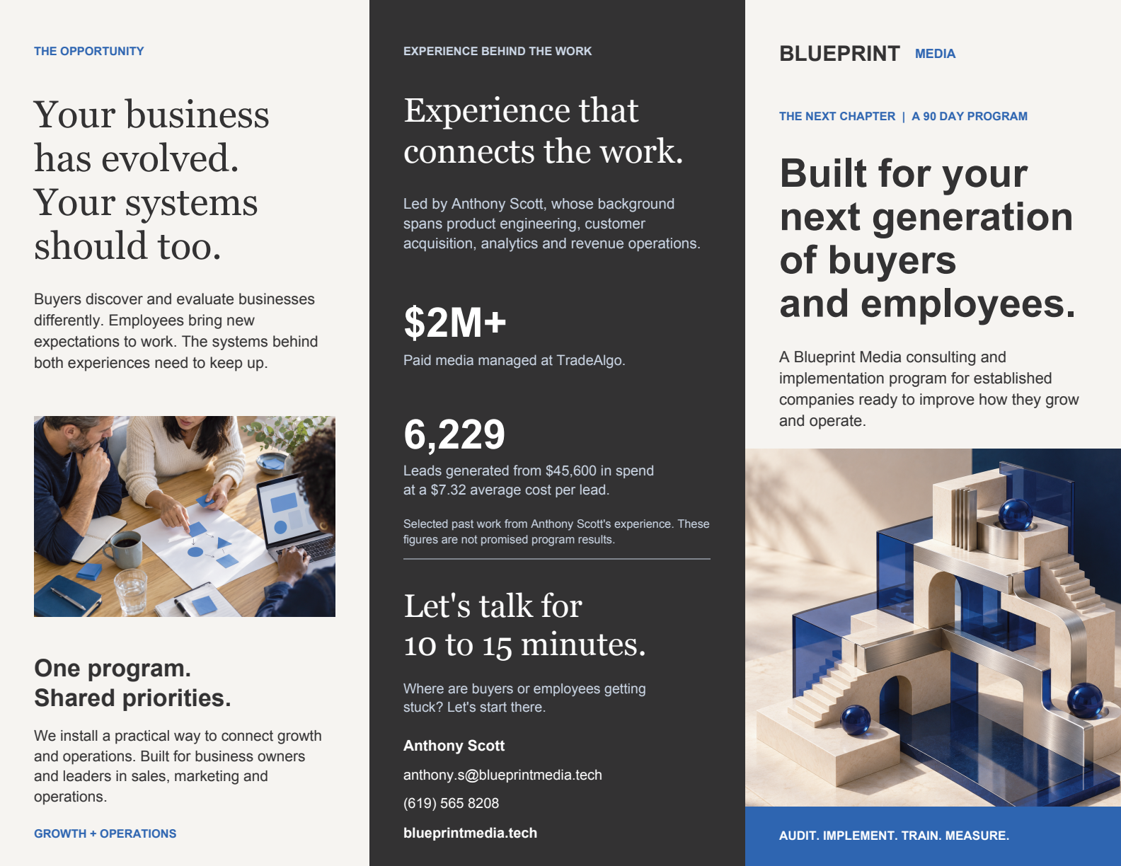
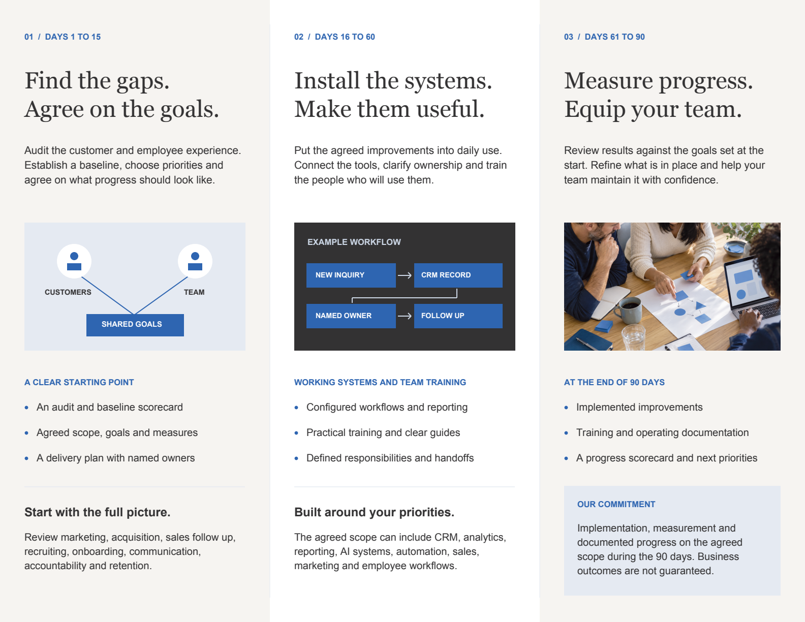
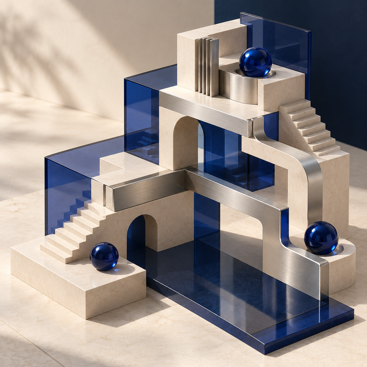
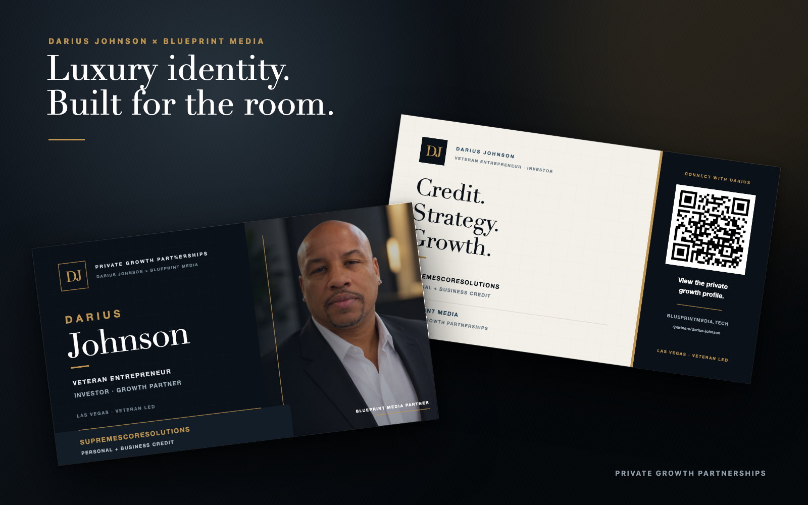
Brochure spreads are existing layout previews; the business-card image is a presentation mockup. The architectural illustration is AI-generated. Figures inside the source layouts are not results attributed to the graphic design; printing and distribution are not documented.
From a static graphic to a short motion piece
Motion / 6.5 seconds / sound off
The same hierarchy,
revealed over time.
The headline appears first, followed by supporting information and the campaign’s final action. The existing motion asset extends the static design into a short sequence.
Visual sequence: “Stop writing one page at a time. Build the content engine.” Analytics and the redacted article library appear, followed by “Get the free AI Operator Stack.” The video has no audio; the full static graphic appears in the gallery above.
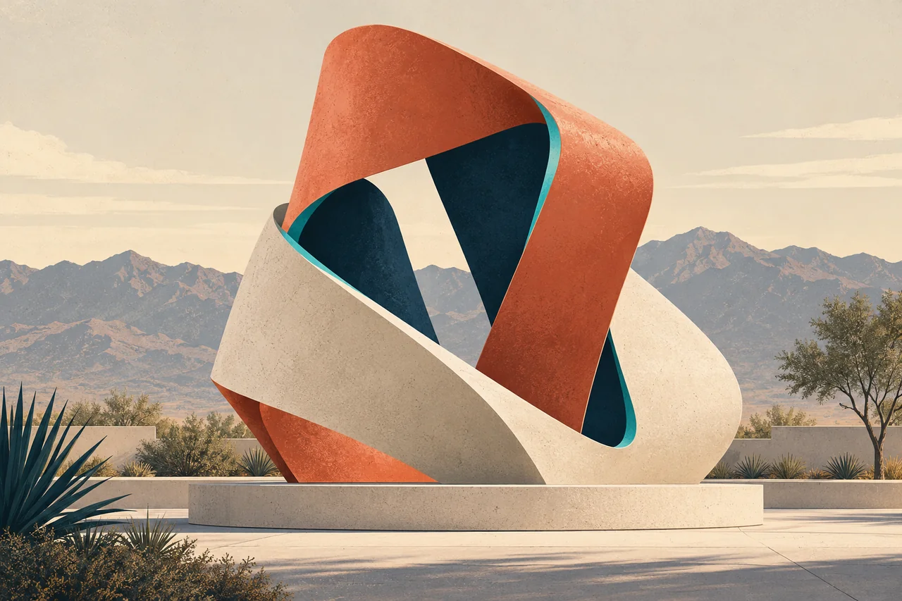 Self-initiated concept / illustrative
Beyond the campaign / public art
A visual system
for discovery.
An original design study connecting a printed guide, mobile artwork story, and promotional tile through a shared palette, numbered markers, and clear information.
AI-generated fictional artwork and illustrative routes. This is a self-initiated study, not a City commission or actual collection inventory.
Explore the public art design studyHow the work comes together
A clear idea.
A consistent system.
A finished piece.
- 01
Find the message.
Define the audience, the context, and the one idea the design needs to communicate.
- 02
Build its visual language.
Set the typography, imagery, palette, and information hierarchy around that idea.
- 03
Make it work across formats.
Adapt the composition to its placement, review legibility at real size, and prepare the final assets.
Graphic Design & Visual Storytelling in practice.
Anthony Scott / Blueprint Media LLC